7 julio 2015
Creative Image and Design

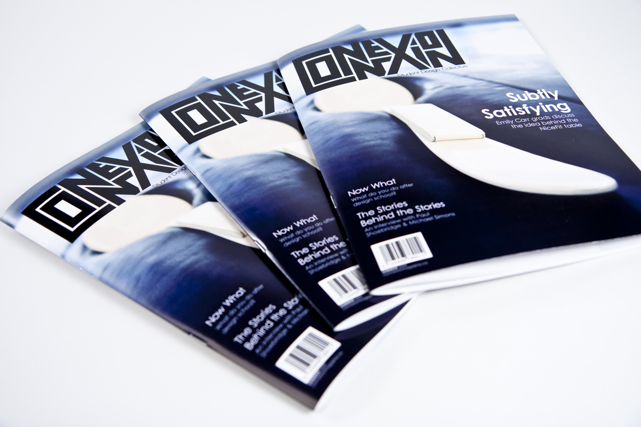
 Graphics with very little white space runs the risk of appearing busy, cluttered, and is typically difficult to read. Some designs compensate for this problem through the careful use of leading and typeface.When space is at a premium, such as some types of magazine, newspaper, and yellow pages advertising, white space is limited in order to get as much vital information on to the page as possible. A page crammed full of text or graphics with very little white space runs the risk of appearing busy, cluttered, and is typically difficult to read. Some designs compensate for this problem through the careful use of leading and typeface.